
Until now, we were learning about SwiftUI views that are static and don’t require actions from users.
Today we start learning how we can make apps more interactive. So we are going to start with the buttons.
SwiftUI allows defining buttons in different ways. Let’s take a look at some of them.
We can call a Button constructor passing label and action as arguments.
init(_ titleKey: LocalizedStringKey, action: @escaping () -> Void)
Button("Simple button", action: {
  print("Button clicked!")
})
That defines the simplest button, where the content is a text. That makes the button look in the standard style.
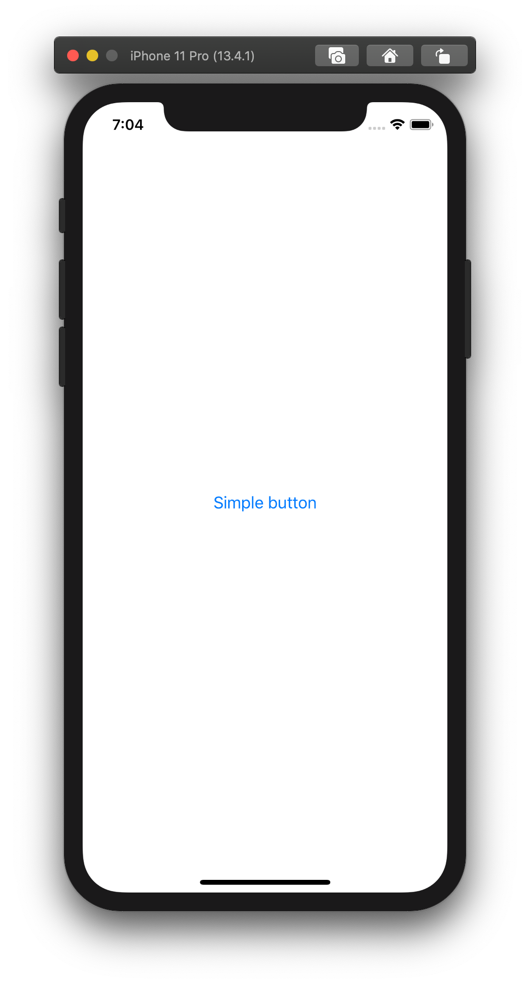
The action describes actions that will happen when a user taps on the button.
That example will print out the text “Button clicked!” in the debug area of Xcode.
We can achieve the very same result by using a constructor that Button view provides.
init(action: @escaping () -> Void, label: () -> Label)
Button(action: {
  print("Button clicked")
}) {
  Text("Simple button")
}
In this case, we have to explicitly specify that the content of the button is a text view.
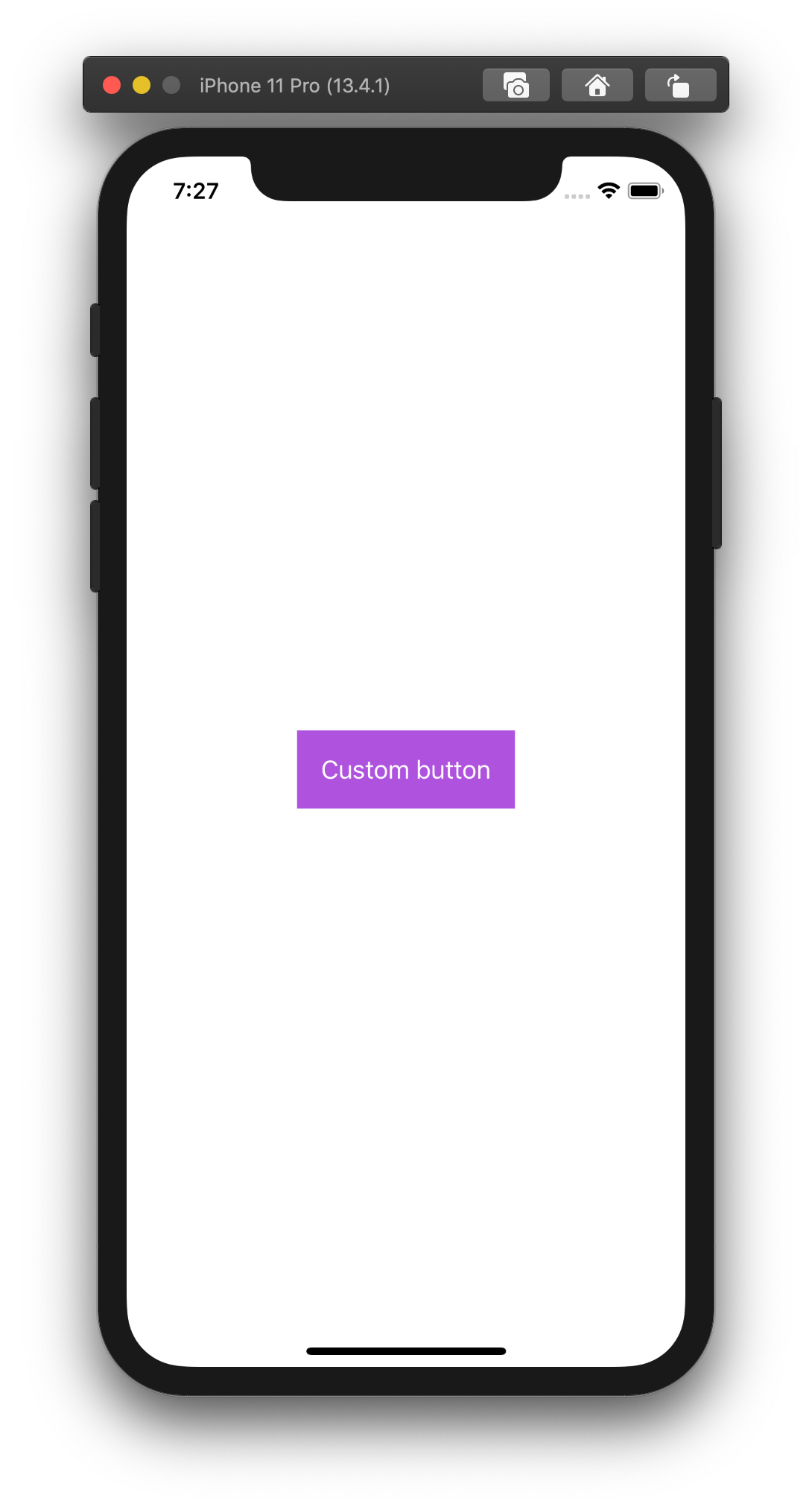
Even though those buttons look the same, the second approach opens new ways to customize buttons.
Button(action: {}) {
  Text("Custom button")
    .foregroundColor(.white)
    .padding()
}
.background(Color.purple)
Here we set the label color to white and the button’s background to purple.
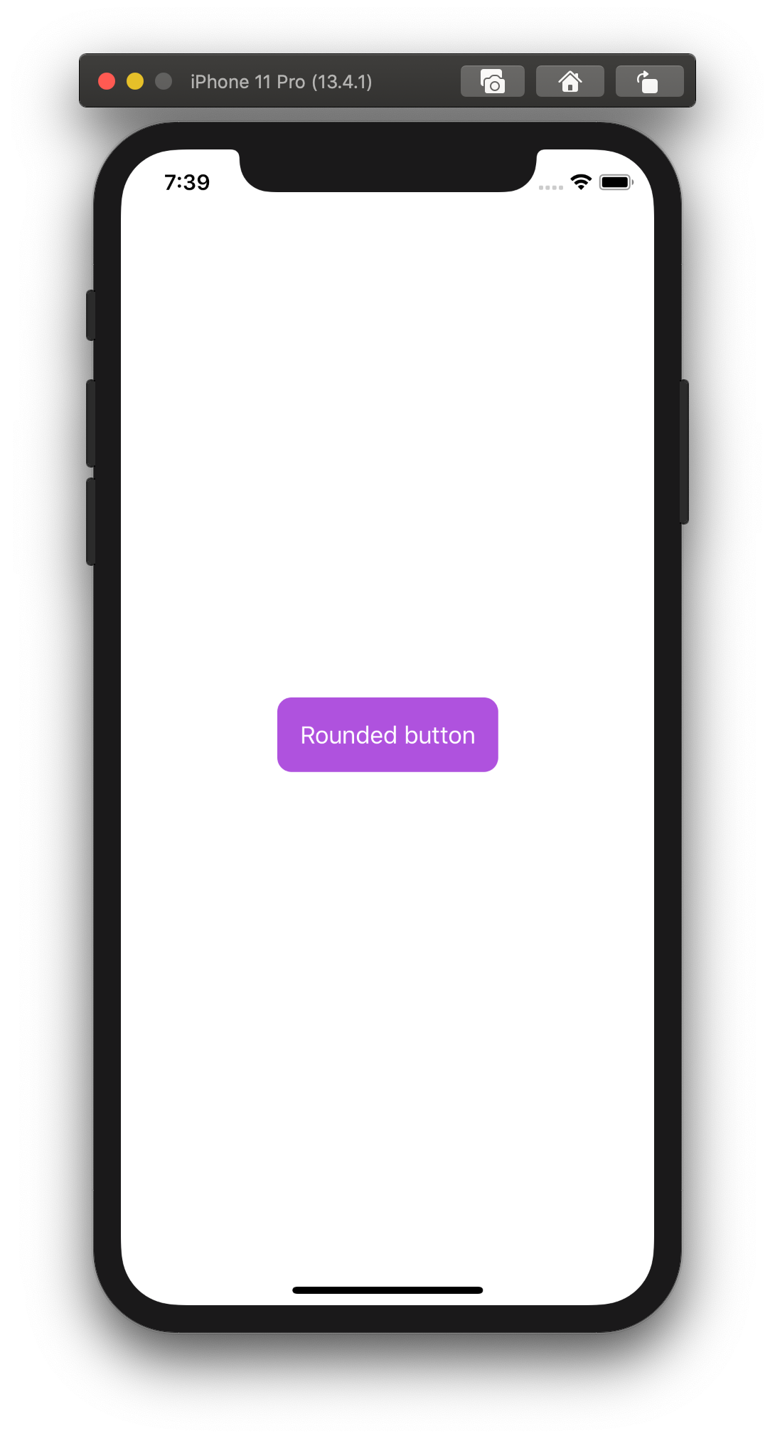
The button has sharp corners. We can make them round by applying the cornerRadius() modifier.
Button(action: {}) {
  Text("Rounded button")
    .foregroundColor(.white)
    .padding()
}
.background(Color.purple)
.cornerRadius(10)
Here is another example, where we are using overlay modifier
Button(action: {}) {
  Text("Outline button")
    .foregroundColor(.purple)
    .padding()
}
.overlay(
  RoundedRectangle(cornerRadius: 10)
    .stroke(Color.purple, lineWidth: 1)
)
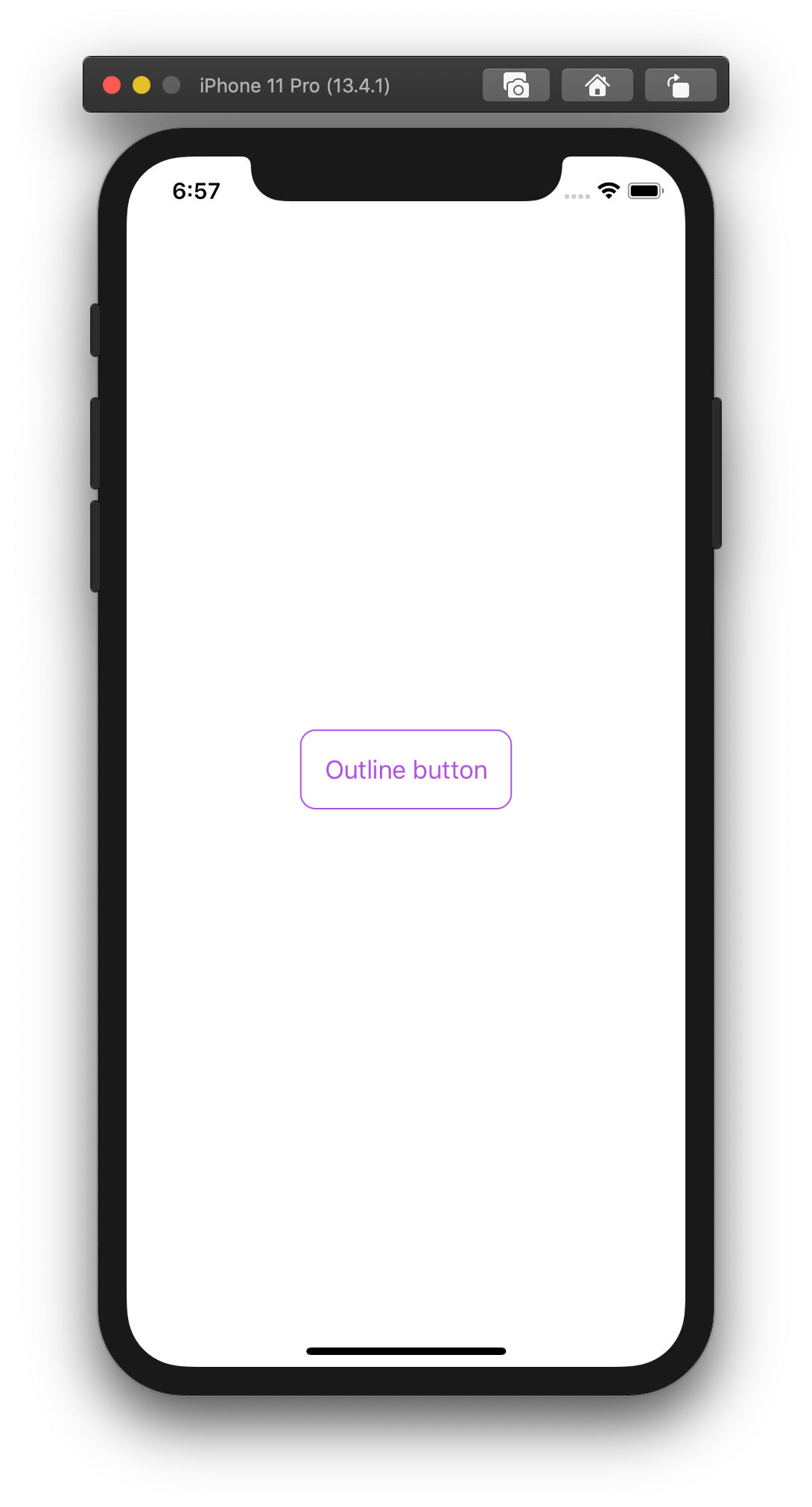
That makes the button looks transparent.
We can go further and display more information on the button. For example, we can have both text and an image.
Button(action: {}) {
  HStack {
    Image(systemName: "play.fill")
    Text("Play")
  }
  .foregroundColor(.purple)
  .padding()
}
.overlay(
  RoundedRectangle(cornerRadius: 10)
    .stroke(Color.purple, lineWidth: 1)
)

Wrapping up
In this short article, we have learned how to define and customize buttons in SwiftUI.
As you can see, the list of examples can go on and on. We can apply different modifiers to build the buttons we want.
Now, it’s your turn. Try to apply modifiers to a button, change some values, and check the result.