
Modern mobile applications rarely consist of a single screen. Splitting screens into tabs, probably one of the most popular ways.
In one of the previous articles, we already covered the basics of React Navigation.
Today we are going to look into tab navigator from React Navigation and see how we can extract our existing screens and introduce new ones.
In the previous article, we’ve implemented the high scores functionality. We are persisting all that data in a local storage using AsyncStorage.
It would be great if we introduce a separate screen, where the user can check the high scores.
Let’s get started.
Before we jump into an implementation of the tab navigator, I would like to make some changes in the existing code. That should make things easier later.
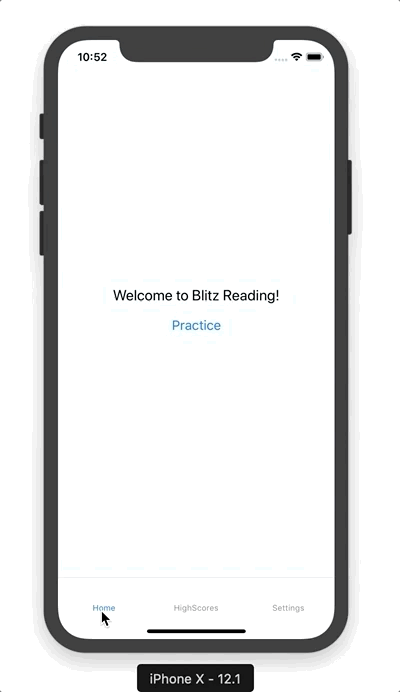
First, we’re going to extract our initial screen from the App.js file into a separate Welcome screen.
Create src/screens/WelcomeScreen.js with the following content:
import React, { Component } from 'react';
import { Button, Text, View } from 'react-native';

import styles from '../styles';

export default class WelcomeScreen extends React.Component {
  render() {
    return (
      <View style={styles.container}>
        <View>
          <Text style={styles.welcome}>Welcome to Blitz Reading!</Text>
          <Button
            onPress={() => this.props.navigation.navigate('Practice')}
            title="Practice"
          />
        </View>
      </View>
    );
  }
}
The body of the render() method is a former body of render() method from the App component.
Now, at the top of the App.js file we need to import that screen:
import WelcomeScreen from './src/screens/WelcomeScreen';
Once we’ve extracted the body of App component, we can simplify it by returning the AppNavigator from there.
class App extends React.Component {
  render() {
    return <AppNavigator />
  }
}
Now we need to update an AppNavigator to use welcome screen instead of the App component:
const AppNavigator = createSwitchNavigator({
  Welcome: WelcomeScreen,
  Practice: PracticeScreen,
  Results: ResultsScreen
});
We can run an application and ensure it works.
As a finishing touch of these changes, let’s rename AppNavigator to HomeNavigator.
Once we do that, our App component should look like that:
class App extends React.Component {
  render() {
    return <HomeNavigator />
  }
}

const HomeNavigator = createSwitchNavigator({
  Welcome: WelcomeScreen,
  Practice: PracticeScreen,
  Results: ResultsScreen
});

export default createAppContainer(HomeNavigator);
We are done with the initial refactoring and can move on to the implementation of a tab navigator.
Tab navigator
The usage of tab navigation isn’t much different from using any other navigators of React Navigation. It has its unique properties, but the general structure is the same.
To define a tab navigator we need to import createBottomTabNavigator from react-navigation library.
import {
  createSwitchNavigator,
  createBottomTabNavigator,
  createAppContainer
} from 'react-navigation';
Then we use the function to define the routes of the navigator and link it with screens.
const AppNavigator = createBottomTabNavigator({
  Home: HomeNavigator,
  HighScores: HighScoresScreen,
  Settings: SettingsScreen
});
The route of any navigator can link to a screen component as well as to another navigator.
As you can see from the example above, we are linking Home route with our existing HomeNavigator.
That makes our home navigator nested into app navigator.
Now, as our app navigator become a top-level navigator we need to pass it to createAppContainer.
Change
export default createAppContainer(HomeNavigator);
to
export default createAppContainer(AppNavigator);
We have defined two additional screens for the tab navigator, but neither HighScoresScreen nor SettingsScreen exist yet.
Let’s create them.
First, import those screens at the top of the file:
import HighScoresScreen from './src/screens/HighScoresScreen';
import SettingsScreen from './src/screens/SettingsScreen';
Then, create a src/screens/HighScoresScreen.js file with the following content:
import React, { Component } from 'react';
import { Button, Text, View } from 'react-native';

import styles from '../styles';

export default class HighScoresScreen extends React.Component {
  render() {
    return (
      <View style={styles.container}>
        <View>
          <Text style={styles.welcome}>High Scores</Text>
        </View>
      </View>
    );
  }
}
and a src/screens/SettingsScreen.js file with the same content as a HighScoresScreen component.
The only difference that it should contain “Settings” text instead of “High Scores”.
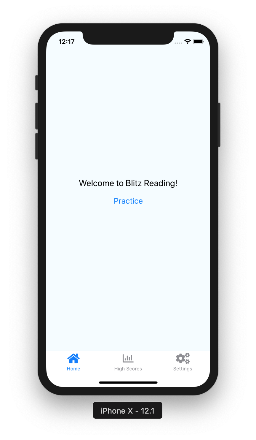
Now, our application has 3 tabs at the bottom of the screen, and we should be able to toggle between them.
At that moment our tabs labeled with the text only. To make them look better we can customize them with different icons.
There are different ways to add icons to a project. We can add image files to our project and use them one by one.
We can also use 3rd party libraries, which provide us with icon sets.
One of these libraries react-native-vector-icons. It provides the several sets of popular icon bundles.
Let’s add it to a project by running those commands from the terminal.
→ npm install react-native-vector-icons --save
→ react-native link react-native-vector-icons
Now, in App.js file let’s import it.
import Icon from 'react-native-vector-icons/FontAwesome5';
Here we are using a subset of icons provided by FontAwesome. It’s also possible to use icons from different sets at the same time.
To customize tab navigator we can pass extended options to createBottomTabNavigator:
const AppNavigator = createBottomTabNavigator(
  {
    Home: {
      screen: HomeNavigator,
      navigationOptions: {
        tabBarIcon: ({tintColor}) =>
          <Icon name="home" size={25} color={tintColor} />
      }
    },
    HighScores: {
      screen: HighScoresScreen,
      navigationOptions: {
        tabBarLabel: 'High Scores',
        tabBarIcon: ({tintColor}) =>
          <Icon name="chart-bar" size={25} color={tintColor} />
      }
    },
    Settings: {
      screen: SettingsScreen,
      navigationOptions: {
        tabBarIcon: ({tintColor}) =>
          <Icon name="cogs" size={25} color={tintColor} />
      }
    }
  }
);
In the example above, we’ve extended every route of our app navigator.
We defined navigationOptions with the tabBarIcon inside.
The tabBarIcon receives a function with the several arguments and returns a component.
We use tintColor argument to set an icon to the default color.
Then we return an Icon component, which we’ve imported from the icons library above.
We pass the name as an icon name, size, and color of an icon.
In addition to all these options, we customized a tabBarLabel option for high scores screen.
By default, a tab label is set from the route name.
In our case, we would like to use the “High Scores” label instead of “HighScores”.
The result of these changes we can see in the screenshot below:
There is a way to customize the tab navigator more, by passing an object as a second argument to createBottomTabNavigator:
const AppNavigator = createBottomTabNavigator(
  {
    Home: { /* ... */ },
    HighScores: { /* ... */ },
    Settings: { /* ... */ }
  },
  {
    tabBarOptions: {
      activeTintColor: 'orange',
      inactiveTintColor: 'gray'
    }
  }
);
Here we set the active color of icons to orange and inactive to gray.
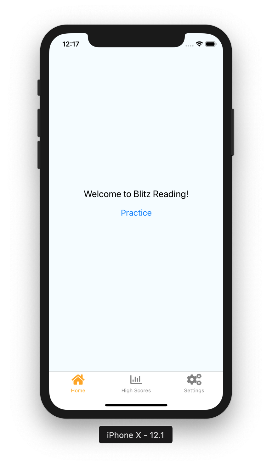
As an option, we can remove the label from the buttons completely.
tabBarOptions: {
  activeTintColor: 'orange',
  inactiveTintColor: 'gray',
  showLabel: false
}

There are of course more ways to customize tab navigator, you can find them on a documentation page.
High Scores screen
Now the High Scores screen does not display any scores. In the last article we already implemented that functionality.
Let’s update our HighScoresScreen.js file to display high scores:
import React, { Component } from 'react';
import { Button, Text, View } from 'react-native';

import styles from '../styles';
import { fetchHighScores } from '../storage/highScoreStorage';
import HighScores from '../components/HighScores';

export default class HighScoresScreen extends React.Component {
  constructor(props) {
    super(props);

    this.state = { highScores: [] };
  }

  async componentDidMount() {
    try {
      let highScores = await fetchHighScores();

      this.setState({ highScores });
    } catch (error) {
      console.log('Error fetching High Scores', error);
    }
  }

  render() {
    return (
      <View style={styles.container}>
        <HighScores data={this.state.highScores} />
      </View>
    );
  }
}
To display high scores we need to render HighScores component and pass all available high scores as a data property.
To do that, first, we need to fetch all high scores.
We are fetching them in the componentDidMount() callback and save them to a state.
These changes will display 10 top high scores on the results screen. It would be great if we can increase that number, but only for high scores screen.
We can pass that value as a property for the HighScores component.
In the render() method of HighScoresScreen update the following line:
<HighScores data={this.state.highScores} totalNumber={25} />
Then, we need to use that property and filter the scores out.
In the src/components/HighScore.js update the getTopScores function to look like:
const getTopScores = (highScores, totalNumber) =>
  highScores
    .sort((first, second) => second.score - first.score)
    .slice(0, totalNumber);
The totalNumber argument will specify the number of scores we are going to display.
Now, we need to pass the number to that function when we call it. Update the body of the component:
const DEFAULT_TOTAL_NUMBER = 10;

export default HighScores = ({ data, totalNumber }) => {
  const highScores = getTopScores(
    data,
    totalNumber || DEFAULT_TOTAL_NUMBER
  );

  return ( /* ... */ );
};
Now the high scores screen displays the list of 25 top high scores.

Wrapping up
Today we’ve learned how to use a tab navigation functionality from React Navigation. We’ve learned how to define tab navigation, how to customize it using icons and colors.
That implementation splits our application into three areas, which allows us to improve them separately.
You can find the complete implementation on a GitHub page.
See you next time.