
A user interface of a mobile application is built from different small parts. All together, they form a single piece, with which users can interact.
To build such an interface using SwiftUI, we need to arrange smaller views in one way or another.
In this article, we are going to learn how to achieve that.
Every SwiftUI view should have a body of type some View, which can return only a single view.
Eventually, we will need to build a view from other smaller views.
Let’s say we want to create a header view, which consists of a title and a subtitle.
We defined a HeaderView with a title as a single Text view.
struct HeaderView: View {
  var body: some View {
    Text("Title")
  }
}
What if we want to extend our header to have a subtitle text as well?
We can try to throw in a second Text view, which will serve the purpose of the subtitle.
struct HeaderView: View {
  var body: some View {
    Text("Title")
    Text("Subtitle")
  }
}
Unfortunately, that code will not compile.
The body field expecting a single view, but we are giving it two.
More than that, SwiftUI doesn’t understand how we want these two text views to be arranged.
Should it render them vertically or horizontally?
We need to be more specific here and give more precise instructions.
That’s where stacks come to the rescue.
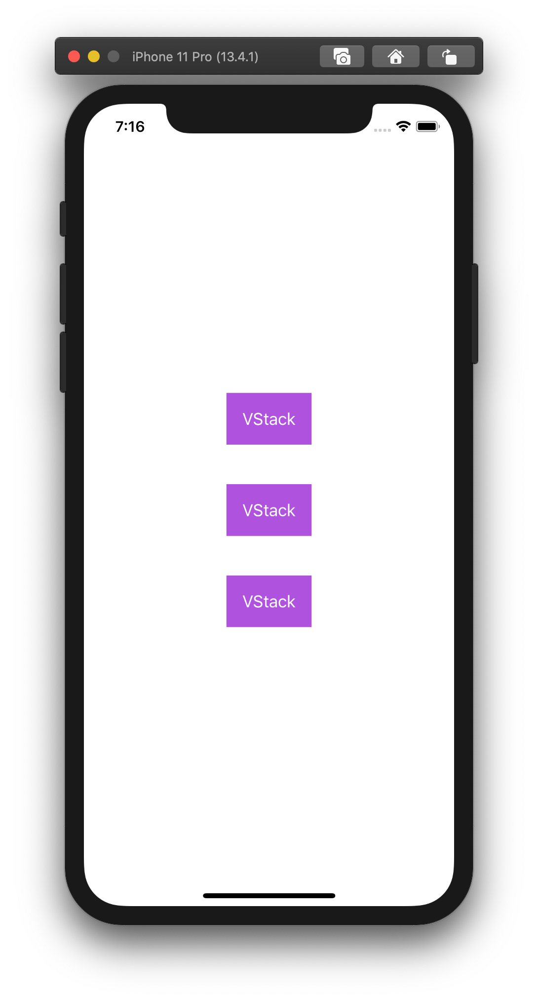
VStack
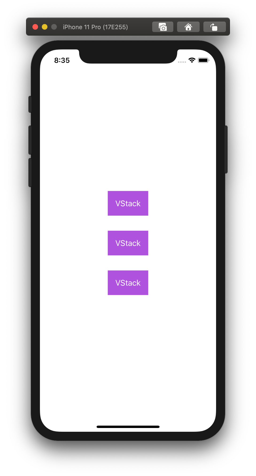
We’ve seen VStack in action in the previous article. We’ve been using it do render a text and a button on the screen.
There is another example with three text views arranged vertically.
struct ContentView: View {
  var body: some View {
    VStack {
      Text("VStack")
        .foregroundColor(.white)
        .padding()
        .background(Color.purple)
        .padding()

      Text("VStack")
        .foregroundColor(.white)
        .padding()
        .background(Color.purple)
        .padding()

      Text("VStack")
        .foregroundColor(.white)
        .padding()
        .background(Color.purple)
        .padding()
    }
  }
}
There is no need to implicitly configure an app layout to work with different screen sizes and device orientation. SwiftUI does all dirty work for us.
Here is how our code looks in landscape mode.
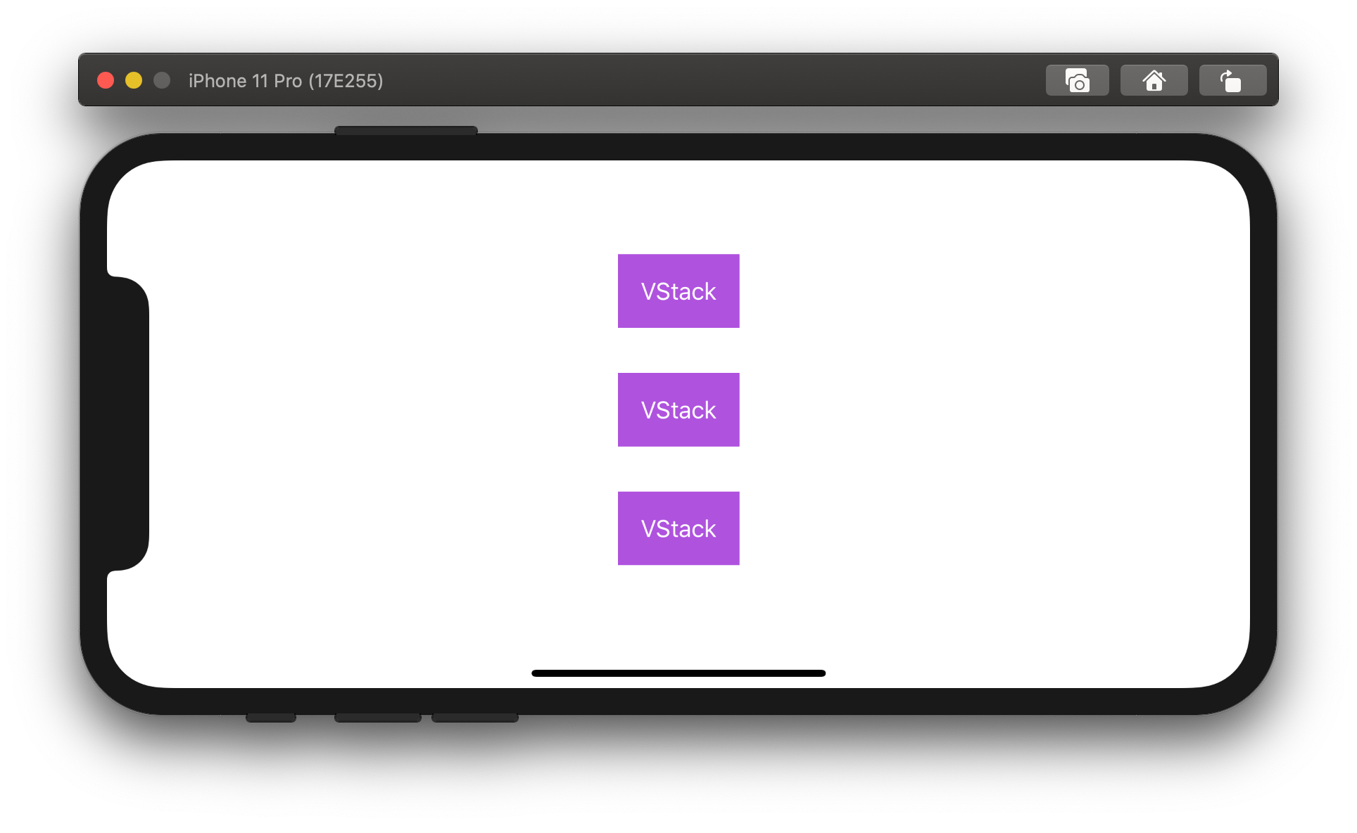
We didn’t do anything extra to make it work.
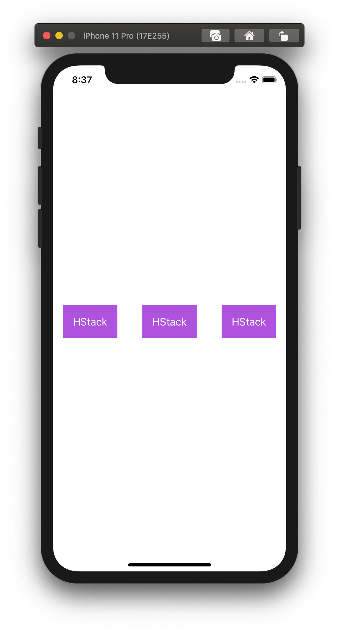
HStack
HStack arranges nested views horizontally.
Here is the same example as above, but now it uses HStack instead of VStack.
struct ContentView: View {
  var body: some View {
    HStack {
      Text("HStack")
        .foregroundColor(.white)
        .padding()
        .background(Color.purple)
        .padding()

      Text("HStack")
        .foregroundColor(.white)
        .padding()
        .background(Color.purple)
        .padding()

      Text("HStack")
        .foregroundColor(.white)
        .padding()
        .background(Color.purple)
        .padding()
    }
  }
}
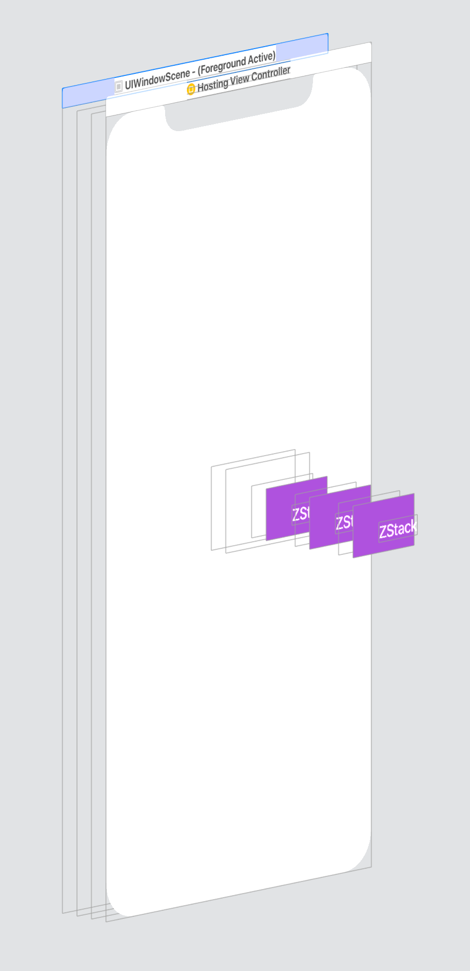
ZStack
SwiftUI also provides a ZStack to arrange view on a Z-axis (or in-depth).
It allows rendering views one on top of the other.
Let’s update our example to use ZStack.
struct ContentView: View {
  var body: some View {
    ZStack {
      Text("ZStack")
        .foregroundColor(.white)
        .padding()
        .background(Color.purple)
        .padding()

      Text("ZStack")
        .foregroundColor(.white)
        .padding()
        .background(Color.purple)
        .padding()

      Text("ZStack")
        .foregroundColor(.white)
        .padding()
        .background(Color.purple)
        .padding()
    }
  }
}
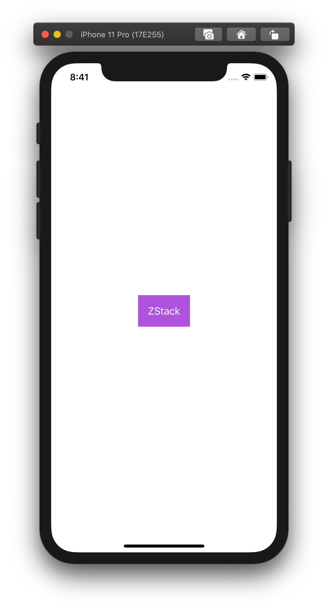
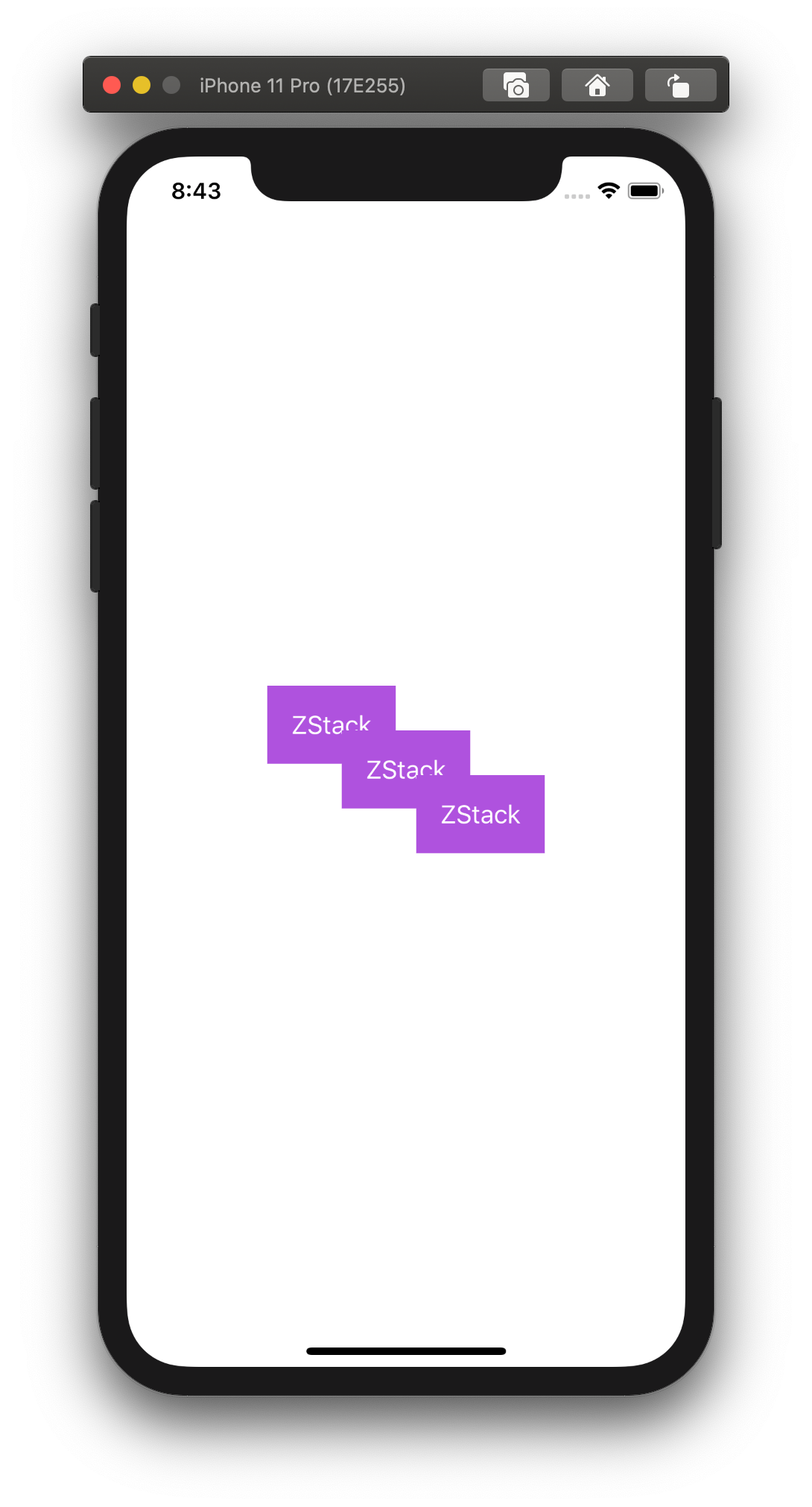
That might look puzzling at first. We can see a single view, where are the others?
They are still there.
If we add some offset to the first and third views, we will be able to see them on the screen.
struct ContentView: View {
  var body: some View {
    ZStack {
      Text("ZStack")
        .foregroundColor(.white)
        .padding()
        .background(Color.purple)
        .padding()
        .offset(x: -50, y: -30)

      Text("ZStack")
        .foregroundColor(.white)
        .padding()
        .background(Color.purple)
        .padding()

      Text("ZStack")
        .foregroundColor(.white)
        .padding()
        .background(Color.purple)
        .padding()
        .offset(x: 50, y: 30)
    }
  }
}
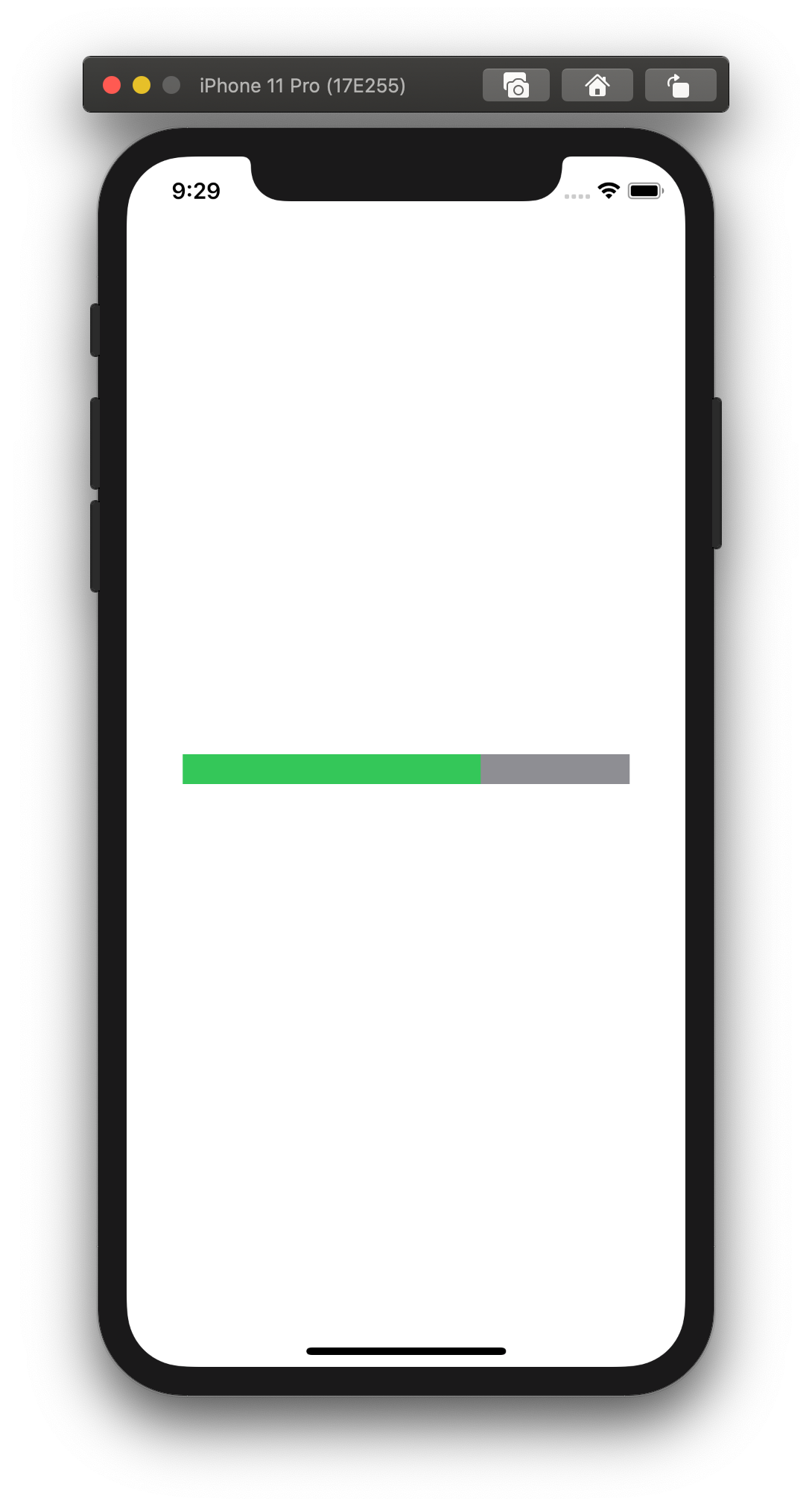
We can use ZStack in many different ways in our application. It can be a stack of cards, a progress bar, etc.
Here is an example of the simplest progress bar.
struct ContentView: View {
  var body: some View {
    ZStack(alignment: .leading) {
      Text("")
        .foregroundColor(.white)
        .frame(width: 300, height: 20)
        .background(Color.gray)


      Text("")
        .foregroundColor(.white)
        .frame(width: 200, height: 20)
        .background(Color.green)
    }
  }
}
Views limit
Stacks allow us to group a bunch of views, although not without limitations. The max number of views we can nest into another view is ten.
Consider the following example. We have a VStack with eleven text views in it.
That causes a compile error because we exceeded the limit of 10 views.
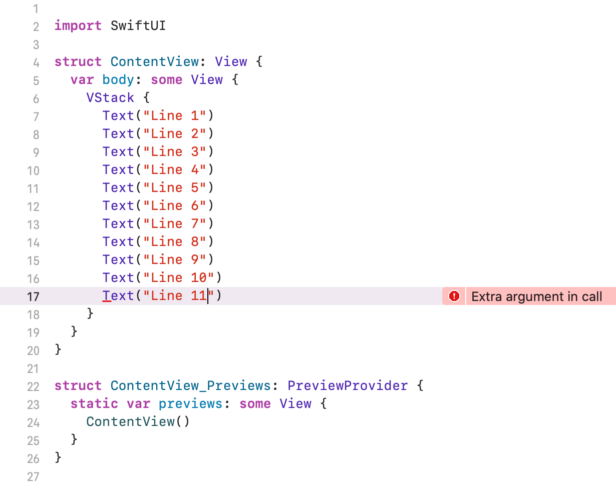
One of the ways to fix it is to split views into smaller groups and wrap them with yet another stack view.
struct ContentView: View {
  var body: some View {
    VStack {
      VStack {
        Text("Line 1")
        Text("Line 2")
        Text("Line 3")
        Text("Line 4")
        Text("Line 5")
        Text("Line 6")
        Text("Line 7")
        Text("Line 8")
        Text("Line 9")
        Text("Line 10")
      }
      Text("Line 11")
    }
  }
}
Spacer
As you can notice, the views from the previous examples are centered. In some situations, we may want to push some views close to the edge of the screen.
The Spacer view can help us achieve that effect.
Here is what the documentation page says about it:
A flexible space that expands along the major axis of its containing stack layout, or on both axes if not contained in a stack.
Let’s take our VStack example and insert a spacer between first and second text views.
struct ContentView: View {
  var body: some View {
    VStack {
      Text("VStack")
        .foregroundColor(.white)
        .padding()
        .background(Color.purple)
        .padding()

      Spacer()

      Text("VStack")
        .foregroundColor(.white)
        .padding()
        .background(Color.purple)
        .padding()

      Text("VStack")
        .foregroundColor(.white)
        .padding()
        .background(Color.purple)
        .padding()
    }
  }
}
The Spacer took all available space between those views.
As a result, the first text view is pushed to the top, and two others towards the bottom.
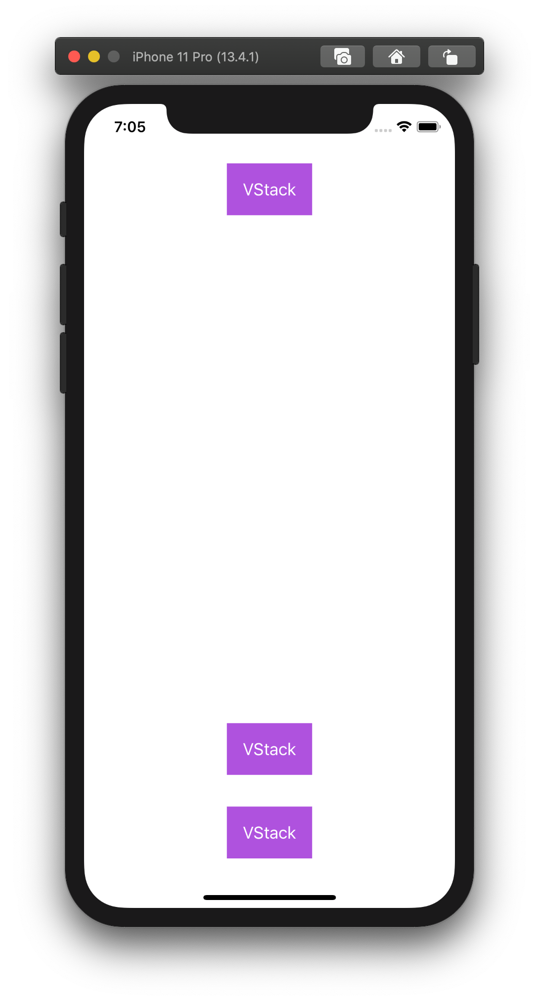
Now, if we add yet another spacer between the second and third text view, space will be distributed between the two spacers.
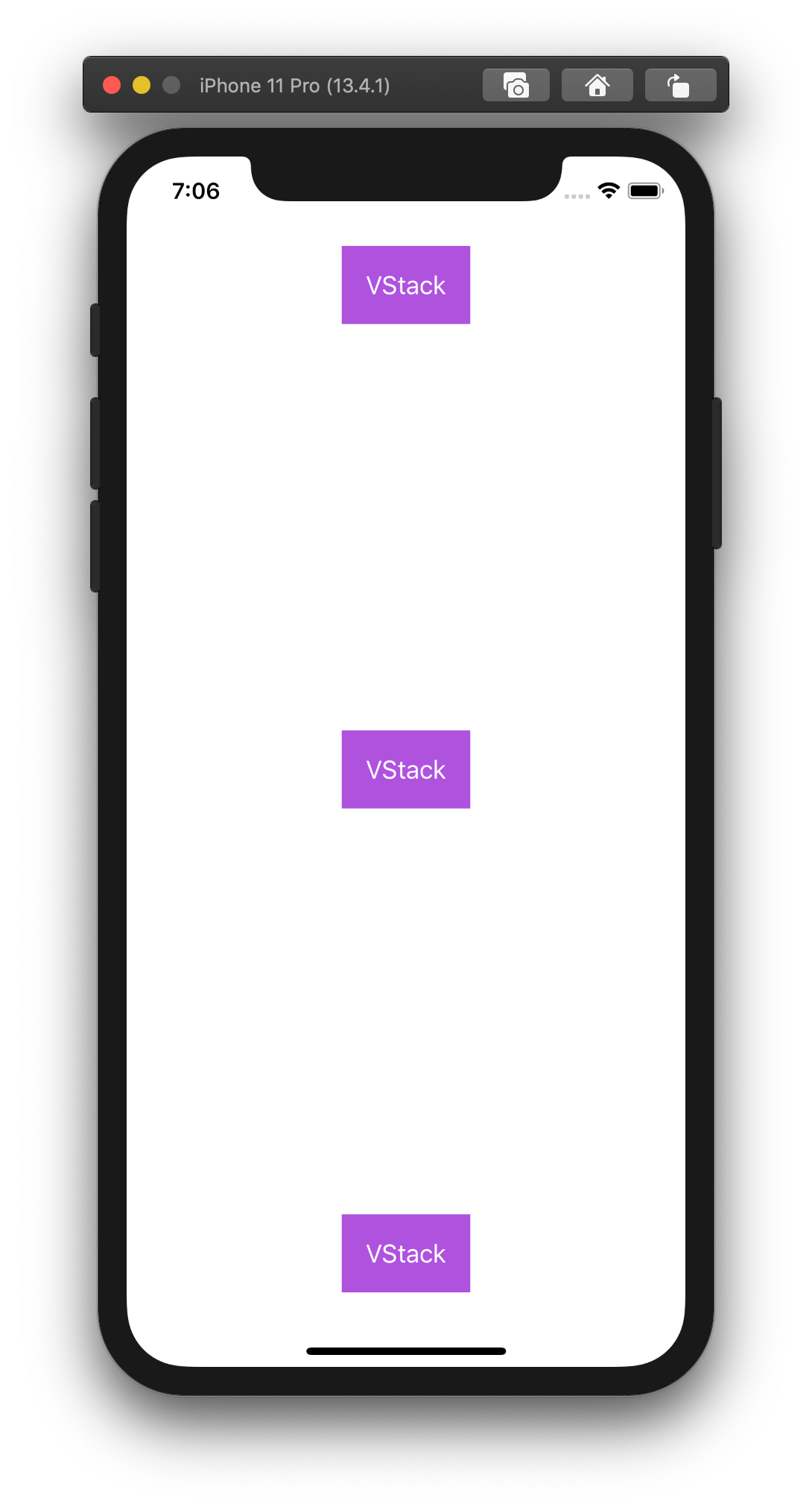
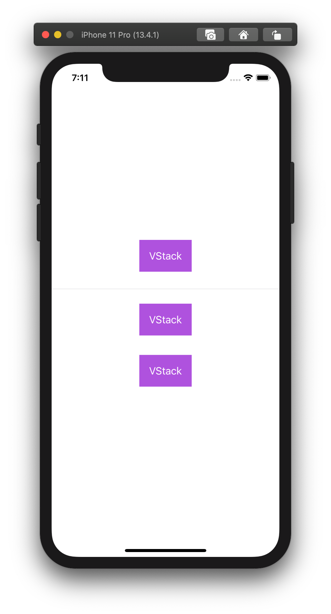
Divider
Yet another element we can use to enrich a layout is a Divider.
A visual element that can be used to separate other content.
We can visually separate the first text view from the rest.
struct ContentView: View {
  var body: some View {
    VStack {
      Text("VStack")
        .foregroundColor(.white)
        .padding()
        .background(Color.purple)
        .padding()

      Divider()

      Text("VStack")
        .foregroundColor(.white)
        .padding()
        .background(Color.purple)
        .padding()

      Text("VStack")
        .foregroundColor(.white)
        .padding()
        .background(Color.purple)
        .padding()
    }
  }
}
Spacing (not Spacer)
All the examples above are using a padding property to add some visual space between each other. It requires to define paddings for every single view.
That approach has some flaws, it resulted in more code and prone to errors.
The stacks can accept a spacing argument, which will set the space between adjacent views.
First, let’s get rid of the paddings from our example.
struct ContentView: View {
  var body: some View {
    VStack {
      Text("VStack")
        .foregroundColor(.white)
        .padding()
        .background(Color.purple)

      Text("VStack")
        .foregroundColor(.white)
        .padding()
        .background(Color.purple)

      Text("VStack")
        .foregroundColor(.white)
        .padding()
        .background(Color.purple)
    }
  }
}
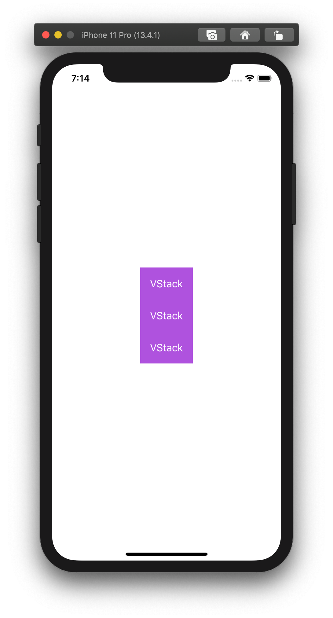
With no space between views, it makes them look like one.
Now, add the spacing 40 as an argument to VStack.
VStack(spacing: 40) {
  // ...
}
That makes it look like our first example with paddings.
That might seem as not a big deal on a simple example like that one, but depending on a situation, we can benefit from choosing one approach over the other.
Wrapping up
What did we learn here?
The stacks allow us to arrange subviews vertically, horizontally, and in-depth.
Spacer and Divider adds more ways to separate some views.
Combining all these tools helps us building rich user interfaces.
Now it’s your turn. Go and try them out.
See you in the next articles.