
In the previous article, we took a look at stacks and learned how to arrange SwiftUI views.
We’ve learned that VStack renders subviews vertically, and HStack - horizontally.
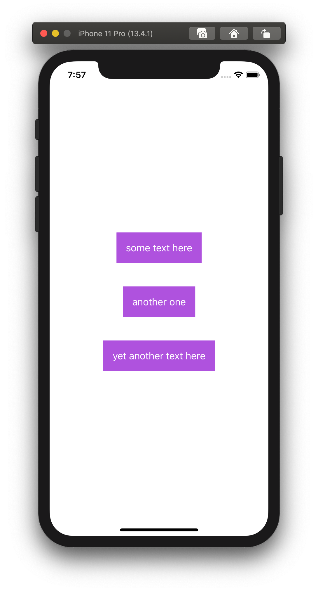
What we also could notice that all subviews inside the stack are centered.
In this article, we are going to learn how to to change the alignment of subviews.
Let’s start with the following example, which uses VStack to arrange subviews vertically.
var body: some View {
  VStack(spacing: 40) {
    Text("some text here")
      .foregroundColor(.white)
      .padding()
      .background(Color.purple)

    Text("another one")
      .foregroundColor(.white)
      .padding()
      .background(Color.purple)

    Text("yet another text here")
      .foregroundColor(.white)
      .padding()
      .background(Color.purple)
  }
}
Now, when all the text views have a different width, we can notice that they are centered, which is the default behavior of stacks.
To change its default behavior, we can provide different values to the alignment argument.
For VStack, that argument accepts a value of HorizontalAlignment struct, which can have one of these options:
// A guide marking the horizontal center of the view.
static let center: HorizontalAlignment

// A guide marking the leading edge of the view.
static let leading: HorizontalAlignment

// A guide marking the trailing edge of the view.
static let trailing: HorizontalAlignment
Here is how we change it.
VStack(alignment: .leading, spacing: 40) { /* ... */ }

VStack(alignment: .trailing, spacing: 40) { /* ... */ }
That produces following results:
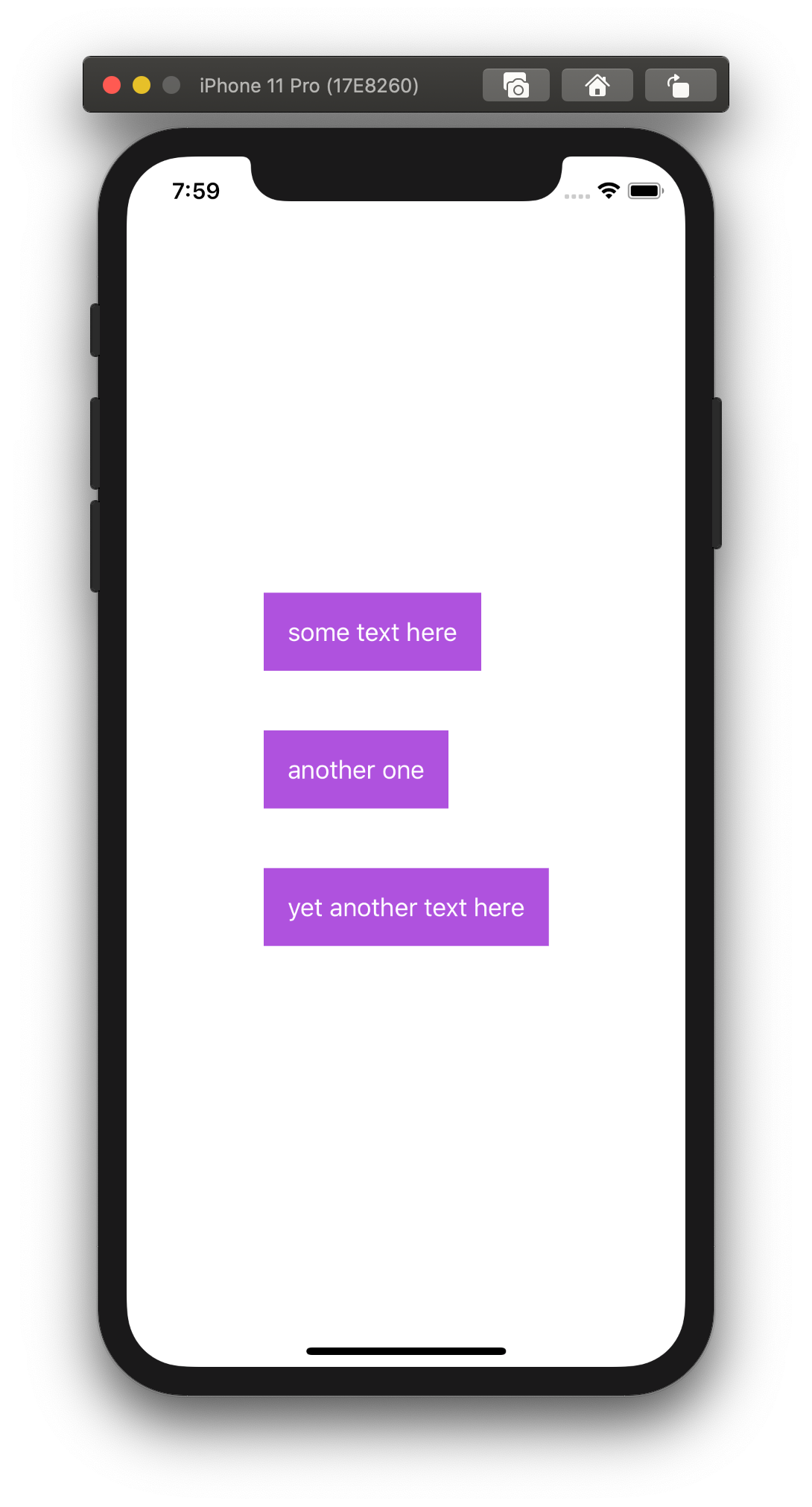
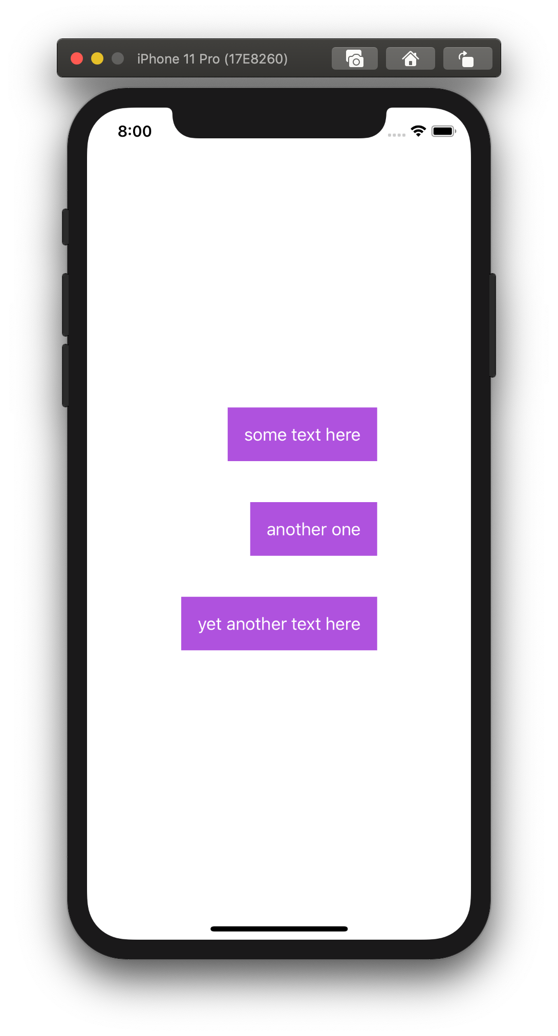
Horizontal alignment
Similar to VStack, we can align views inside HStack as well.
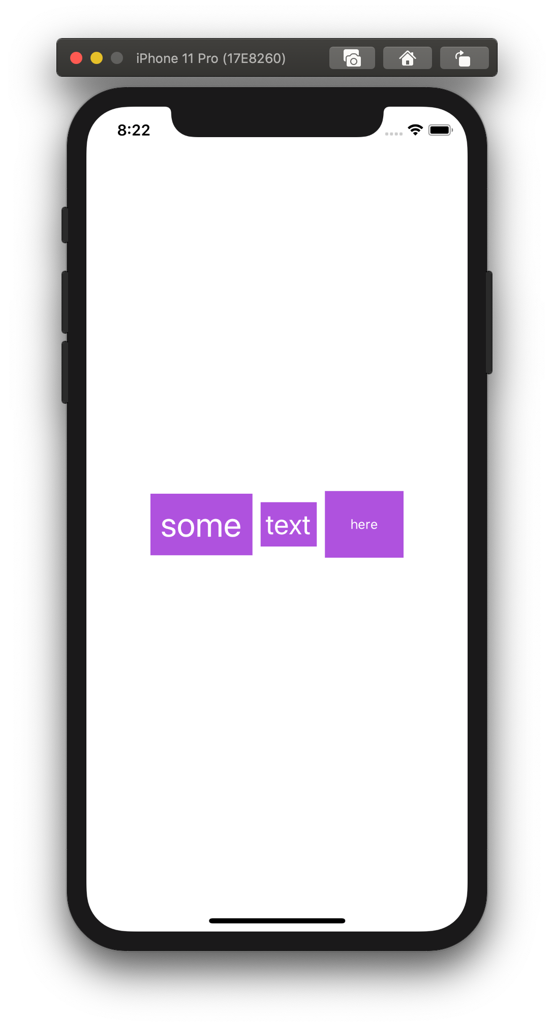
To demonstrate the difference we are going to apply changes in the following example:
var body: some View {
  HStack(alignment: .center) {
    Text("some")
      .foregroundColor(.white)
      .padding(10)
      .background(Color.purple)
      .font(.largeTitle)

    Text("text")
      .foregroundColor(.white)
      .padding(5)
      .background(Color.purple)
      .font(.title)

    Text("here")
      .foregroundColor(.white)
      .padding(25)
      .background(Color.purple)
      .font(.footnote)
  }
}
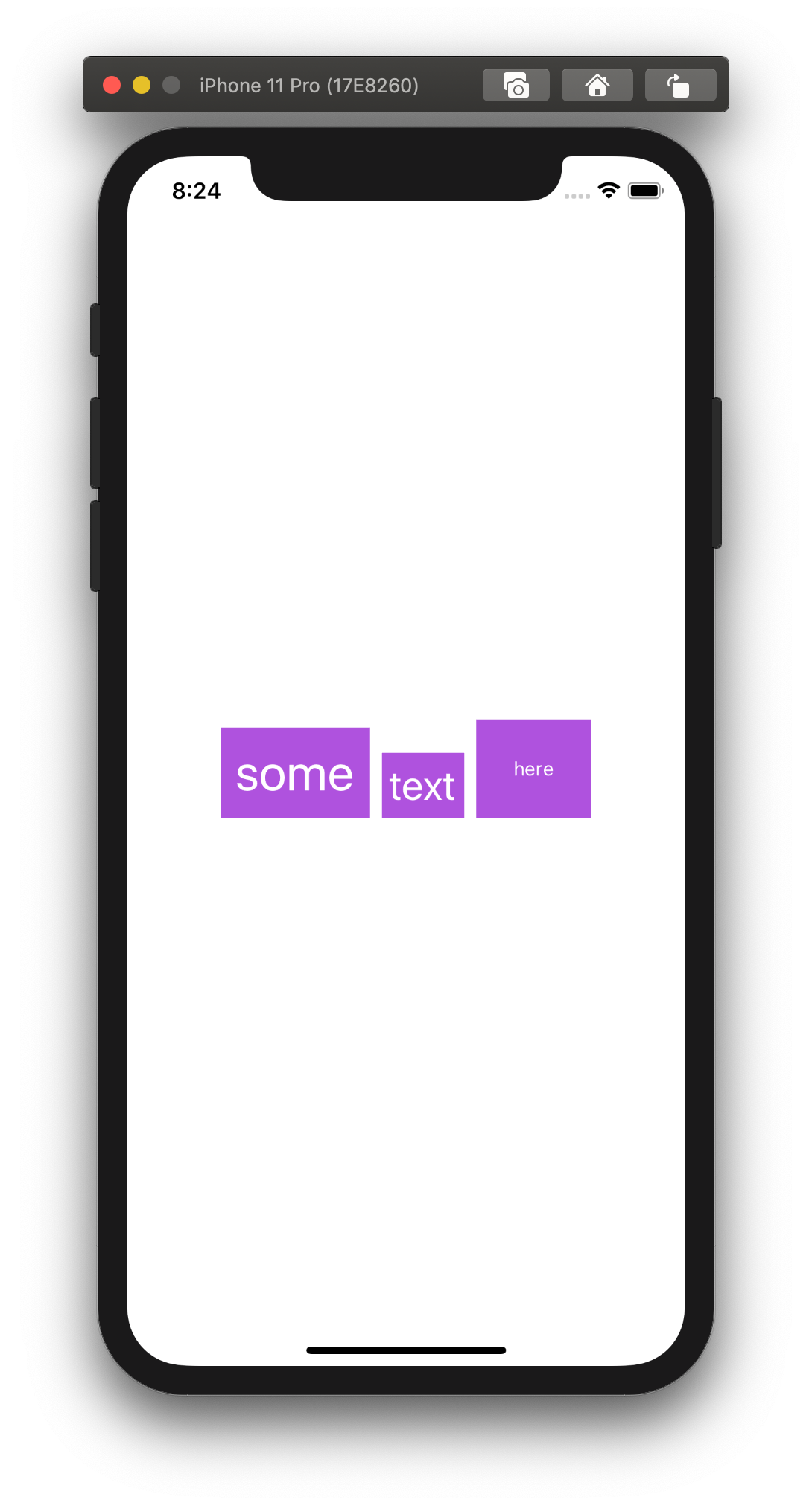
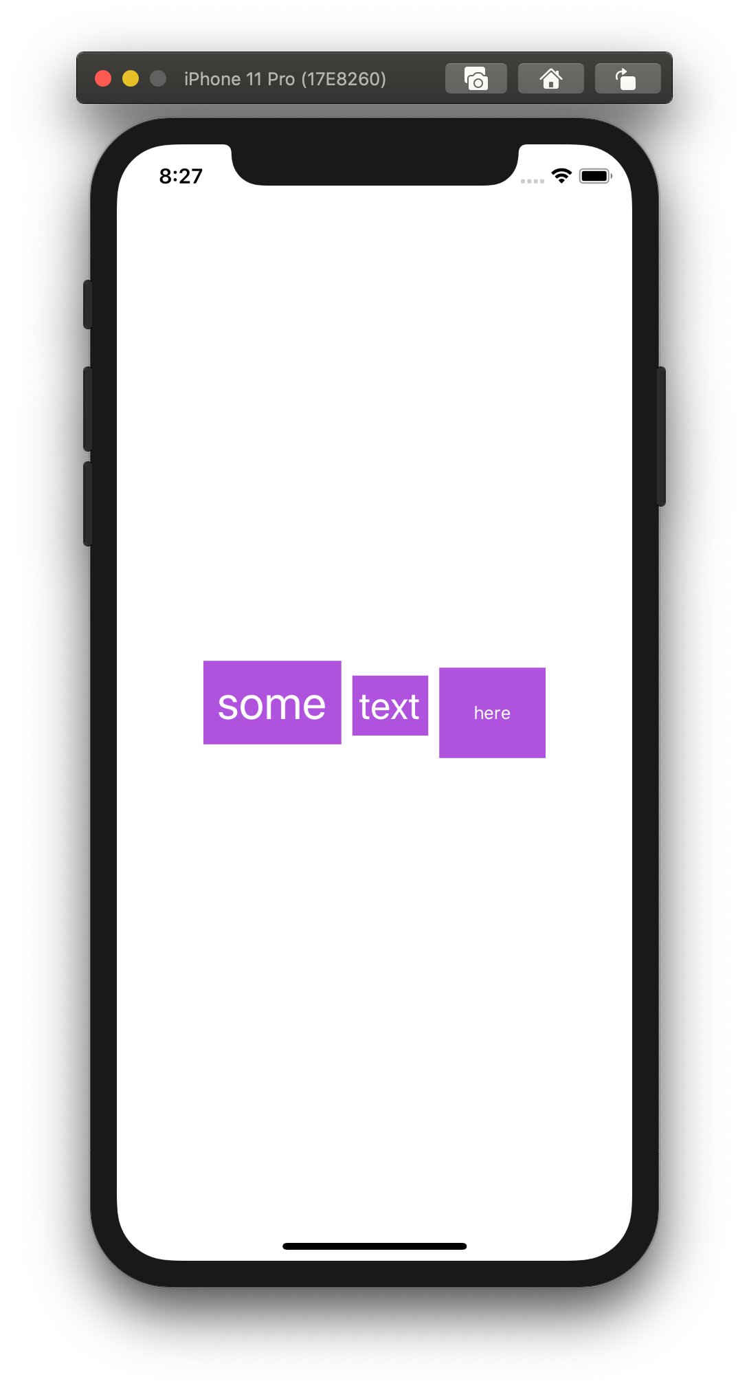
We have three text views, each of which has text with different sizes and paddings.
The alignment argument of HStack accepts a value VerticalAlignment struct, which can be one of:
// A guide marking the bottom edge of the view.
static let bottom: VerticalAlignment

// A guide marking the vertical center of the view.
static let center: VerticalAlignment

// A guide marking the topmost text baseline view.
static let firstTextBaseline: VerticalAlignment

// A guide marking the bottom-most text baseline in a view.
static let lastTextBaseline: VerticalAlignment

// A guide marking the top edge of the view.
static let top: VerticalAlignment
If we set alignment to .top or .bottom SwiftUI will push the views towards the top or the bottom border of HStack respectively.
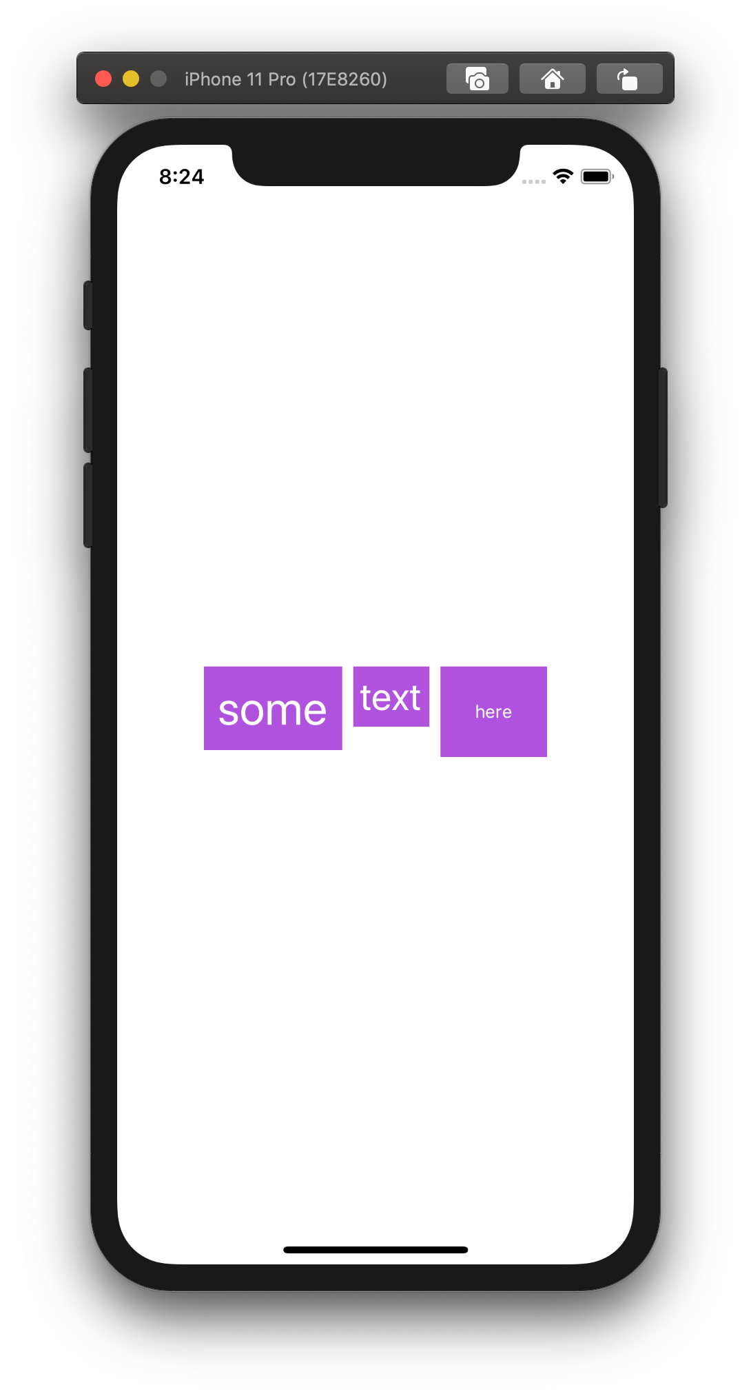
As you can notice, it aligns views by their border, but the text itself looks wavy.
WE can align views by text base line using either .firstTextBaseline or .lastTextBaseline alignment options.
(Z) Alignment
We covered the alignment of VStack and HStack. Now it’s time for ZStack.
Let’s take the following example for the starting point.
var body: some View {
  ZStack {
    Text("some")
      .foregroundColor(.white)
      .padding()
      .background(Color.purple)
      .font(.largeTitle)

    Text("text")
      .foregroundColor(.white)
      .padding()
      .background(Color.green)
      .font(.title)

    Text("here")
      .foregroundColor(.white)
      .padding()
      .background(Color.red)
      .font(.footnote)
  }
}
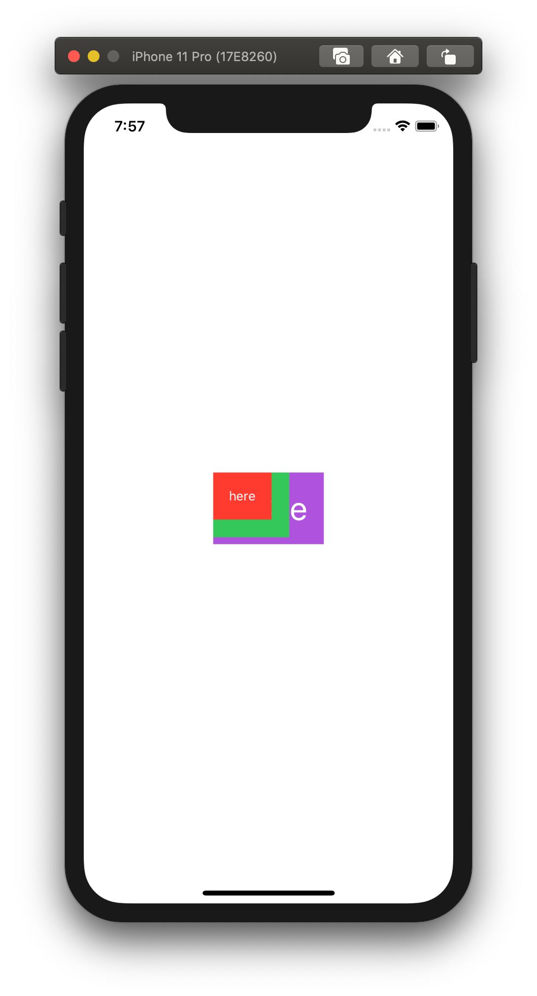
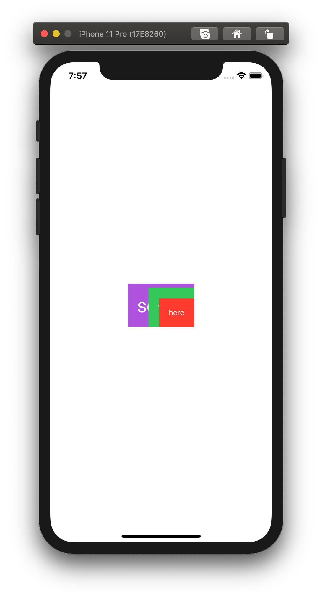
Here we have views of a different size lying on top of each other.
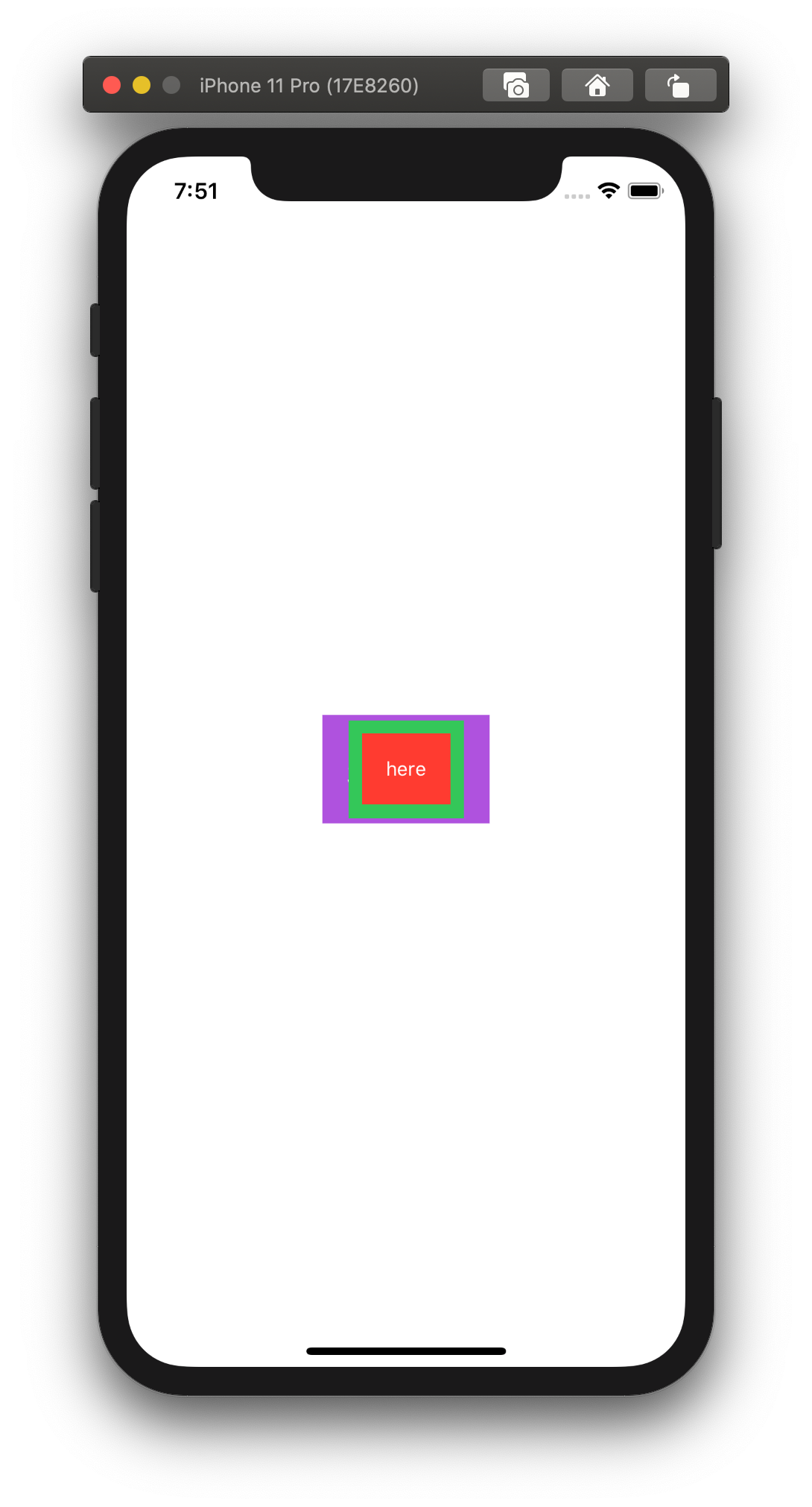
ZStack accepts a value of structure Alignment as an argument, which supports one of the following options.
// A guide marking the bottom edge of the view.
static let bottom: Alignment

// A guide marking the bottom and leading edges of the view.
static let bottomLeading: Alignment

// A guide marking the bottom and trailing edges of the view.
static let bottomTrailing: Alignment

// A guide marking the center of the view.
static let center: Alignment

// A guide marking the leading edge of the view.
static let leading: Alignment

// A guide marking the top edge of the view.
static let top: Alignment

// A guide marking the top and leading edges of the view.
static let topLeading: Alignment

// A guide marking the top and trailing edges of the view.
static let topTrailing: Alignment

// A guide marking the trailing edge of the view.
static let trailing: Alignment
They all look self-descriptive. Let’s check some examples:
ZStack(alignment: .topLeading) { /* ... */ }

ZStack(alignment: .bottomTrailing) { /* ... */ }
That produces the following results.
Wrapping up
That was a quick overview of different alignment options we have when we use stacks.
Now it’s your turn to experiment and practice.